|
Home >> Knowledge Base >>Website Structure
|
|
|
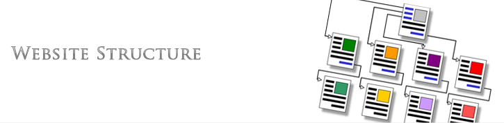
WEBSITE STRUCTURE
|
|
|
|
Most internet users want to see good, clean
content. That’s why an organised
website structure is very
important in creating an online presence
that will be a hit with those who frequently
browse the internet.
|
| |
|
The most important factor for good
website structure is to
making sure that it’s user-friendly. Site
visitors shouldn’t have to click back to the
previous page just to find a page that
they’re interested in. They should be able
to find links to other pages within the same
website on every page—not just the homepage.
If users cannot navigate your website
easily, then the
website structure needs to
be revamped to make user navigation a lot
more convenient. <
|
| |
|
Website structure should be
approached from the viewpoint of the average
user. There should be primary navigation and
secondary navigation options. Make sure that
the user doesn’t have to go through a series
of web pages before finding the info they
need. Actually, many websites nowadays were
built on something called the 3 Clicks
Principle.
|
| |
|
The 3 Clicks Principle is an old rule of
thumb used by many website designers. This
rule is based on the idea that a website
user should be able to navigate from any
page within a site to another within three
clicks. And although it is an unofficial
rule, most websites that you visit every day
were probably designed with this rule in
mind.
|
| |
|
Primary navigation
|
|
There are three types of website navigation
used in web design. Left
navigation is the most commonly used. These
are quite popular because of its response to
user behaviour. People tend to read from
left to right, and the left navigation
panels are what most users first notice.
|
| |
|
Top navigation panels, meanwhile, allow for
more content below. This kind of
web design shouldn’t look
like online ads, but should really feature
useful links to other pages in the site.
Most site visitors ignore ads, especially
those that appear on top of a particular web
page.
|
| |
|
Right navigation menus aren’t really used in
web pages based on the English language.
That’s because of the nature of the language
(and most other languages, with the
exception of Hebrew, Chinese, and other
similar languages), which is read from left
to right. Sites with text that read from
right to left really don’t respond to the
natural behaviour of the vast majority of
readers. Thus,
web design using right
navigation panels may be completely useless
for most countries.
|
| |
|
Secondary navigation
|
|
Other sections of a website, such as the
Privacy Policy, Terms of Use, Site Map, and
other similar pages, are part of secondary
navigation. As such, they shouldn’t
overshadow primary navigation panels.
Web design professionals
should make them less noticeable by reducing
the link text size and making sure that
readers can distinguish between primary and
secondary navigation tools.
|
| |
|
Internal linking
|
|
Convenient site navigation is also an
important part of good
website structure and
web design. To achieve
this, there should be effective internal
linking between pages within the site.
Placing links in page content can be very
useful in helping site visitors find related
info on certain topics within the content.
|
| |
|
The importance of simple design
|
|
Simple web design is the
way to go when designing websites. Readers
don’t really like getting confused. No
matter how trendy a website’s design is, if
users can’t get to the information they
want, that design is useless and should be
fixed. Users should feel comfortable
browsing the site. A website that
complicates things will lose its target
audience. Good
web design prevents that
from happening.
|
| |
| |
|
|